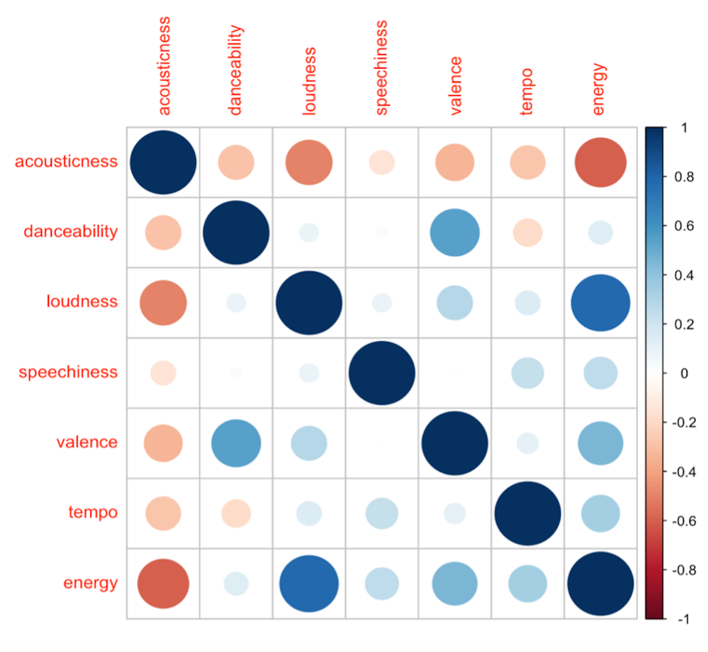
Example 6. Correlation plot for the McGill subset. Larger and darker circles show greater correlation between attributes, with red denoting a negative correlation and blue denoting a positive correlation.